
- 1
- 2
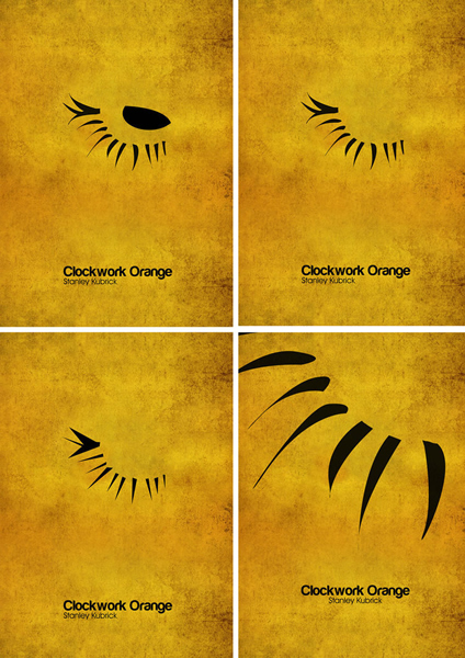
Robin Celebi A Clockwork Orange
http://robincelebi.deviantart.com/
- Œuvres sur Orange mécanique (45)
- Œuvres de Robin Celebi (1)
- Œuvres sur le thème L'icône Kubrick (78)
- Œuvres sur le thème Color Me Kubrick (43)
Both of my A Clockwork Orange themed pieces were based around the idea of minimalism. I had to represent an iconic movie in its simplest terms through whatever form I chose. I opted for Stanley Kubrick's adaptation of A Clockwork Orange because I loved the film and I thought that the eyelash makeup would make an excellent symbol to represent the movie. The most obvious idea would of course have been an orange with some sort of cog inside it (literally a clockwork orange). But I felt that the semi-circle of triangles I ended up with was a much more striking image purely down to its simplicity. Minimalism at its heart. I also liked this for the simple reason that the very fact the poster is so basic it conveys the message and idea of the poster so perfectly in a way that is lacking in the busier advertisements that are today's movie posters.